

The Pearson Test of English (PTE) is a widely recognized English language proficiency exam, ideal for individuals pursuing study, work, or immigration opportunities. Known for its comprehensive approach, the PTE assesses practical language skills through four main sections: Speaking, Writing, Reading, and Listening. The PTE speaking section includes six tasks in total.
Out of the six, the “Describe Image” task assesses both speaking fluency and visual interpretation, skills critical for effective communication in academic and professional settings. Test-takers are given a range of visuals, such as bar graphs, line charts, and pie charts, and they are required to analyze and describe images to provide a structured and accurate description within a limited timeframe.
So, understanding the important elements of a bar graph, planning your thoughts and presenting them coherently, is crucial for scoring well. This article explores the format, techniques, and sample answers specifically for the Bar Graph Describe Image task.
Understanding the Bar Graph Task in PTE
The Bar Graph task in the PTE Describe Image section challenges test-takers to analyze and describe statistical data presented in a bar graph within a limited timeframe. Part of the Speaking section, this task requires clear communication of key details, trends, and comparisons to demonstrate both fluency and data interpretation skills. You’ll be given 25 seconds to examine the graph and prepare, followed by 40 seconds to describe it once the microphone is activated. You can record this only once; hence, you will have to be fluent and clear.
How do you analyze the bar graph? Here are some pointers to help you out: To excel, focus on the following strategies:
- Examine the Basics: Begin with the title, axes, and any labels, identifying what variables and units are being measured.
- Spot Key Trends: Look for key features in the graph, such as the highest and lowest points, significant trends, and any unusual patterns. Focus on three main features to talk about in your response.
- Use Comparisons: Compare the data between variables, periods, or categories. Highlight any significant differences or similarities you observe in the graph.
- Utilize Numbers and Details: When describing, include specific values, percentages, or differences where possible to add precision.
- Organize Your Response: Structure your description with a brief introduction, main points, and a conclusion, delivering a coherent overview of the data.
- Speak Clearly and Confidently: Use active language, avoid filler words, and maintain fluency throughout the response.
In the Describe Image section, timing is crucial. After examining the graph in the initial 25 seconds, begin speaking as soon as you hear the microphone tone. Practice these steps and strategies to become comfortable with this question format, and you’ll be prepared to handle any bar graph that comes your way on test day!
Understanding the PTE exam format is crucial for achieving a high score. If you’re preparing for the test, it’s essential to familiarize yourself with the PTE Exam Pattern 2024: Section-wise Exam Pattern to ensure you’re well-equipped for each section. This guide breaks down the structure, scoring, and key tips to help you excel.
Format of the Bar Graph Task
The bar graph task tests your capacity to think quickly and speak English fluently under pressure situations due to allotted speaking time of 40 secs. You have 25 seconds to observe the image (bar graph, map or picture) and structure the answer. Then, you will have 40 seconds to record the response through a microphone. Remember that you have to immediately start speaking after hearing a short beep tone played once the microphone is turned on. Speak the related content fluently, as you can record it only once. Upon finishing the answer, in the progress bar the Recording status will change to Completed. Here is a breakdown of the format for describing a bar graph in the PTE Describe Image task:
| Number of Question | 1 |
| Time to Analyze the Question | 25 seconds |
| Time to Answer the Question | 40 seconds |
| Total time | 75 to 90 Seconds |
| Skills Assessed | Quick Thinking and Brainstorming Analyzing Skills English Fluency in Speech Ability to frame answers in a short time |
Step-by-Step Approach for PTE Bar Graph Task
It is important to describe all of the image’s parts, their correlations, and any prospective progression or consequences through: Introduction, body and conclusion. Here’s a versatile template to guide you through describing bar graphs:
1. Introduction
Start with an introductory statement identifying the chart type and main topic. Paraphrase the title, if available, and mention key elements like the axes and what they represent.
Example: “The provided bar graph shows the comparison between X and Y across various categories.”
2. Main body
In the main body, focus on the three most significant features. Identify the highest and lowest values, any notable trends, and key comparisons.
Essential Elements to Include in Your Response
- Key Trends: Mention noticeable increases or decreases.
- Comparisons: Draw direct comparisons where relevant (e.g., “X is double Y”).
- Significant Figures: Incorporate specific numbers to enhance clarity.
Example: “A review of the graph reveals that category A has the highest value, while category B is the lowest.”
3. Conclusion
Wrap up with a brief conclusion summarizing the main insights or possible interpretations. This could include a prediction or a general observation.
Example: “In conclusion, the data suggests that X generally exceeds Y, indicating a strong trend.”
Sample Bar Graph Questions and Answers
Let’s examine some sample questions and guide you through answering it.
Sample Question 1:
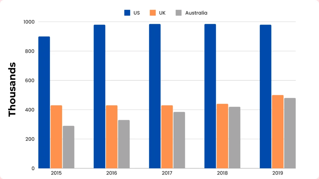
International students enrolled in higher education in the top three countries, 2015–2019.
Introduction
First and foremost is the introduction. How can we paraphrase the title? Let’s look at a sample introduction.
This graph provides insights into the enrollment of international students in higher education for the years 2015 to 2019. The focus is on three countries – the US, the UK, and Australia.
Description
Now, it is time to identify the three most important features. These could be the highest points, the lowest points, or another one.
Here is an example of the main features.
- The United States had the highest number of international student enrollments throughout the recorded years, fluctuating between 850,000 and nearly one million.
- In contrast, the number of international students studying in the UK, the second-most popular country, remained relatively steady, but much lower, at just over 400,000.
- Finally, Australia witnessed a continual rise in the population of overseas students, from around 300,000 to well over 400,000.
Conclusion
Once you have covered the three key points, it is time to conclude. You can summarise the data like this.
The image shows that the US is the most popular country with international students, followed by the UK, then Australia.
Or you could make a prediction about what will happen in the future.
Based on this, it seems like Australia may soon overtake the UK as the second most popular destination.
Sample Question 2:
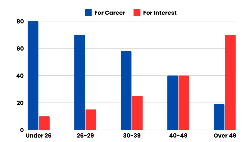
Reasons for study according to age for student.
Answer:
This bar graph illustrates the motivations for studying across different age groups.
For students under 26, the primary reason for studying is career-focused, with around 80 individuals citing career advancement as their main motivation, while only 10 study purely out of interest. In the 40-49 age group, there is an even split between those who study as a hobby and those motivated by career growth.
For students over 49, studying is largely driven by personal interest rather than career goals. Overall, younger students tend to study for career development, while older students increasingly pursue education as a personal interest or hobby.
Sample Question 3:
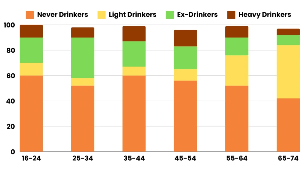
Frequency and intensity of drinking patterns Across various age groups.
Answer:
The bar chart depicts statistics on people’s drinking habits in the United States by age group.
The age group 16 to 24 had the highest percentage of individuals who never drank. With age, the percentage tended to decline. Only 40% of those aged 65 to 74 had never drunk. On the other hand, the percentage of individuals who had stopped drinking increased with age.
A unique trend emerged when it came to the percentage of heavy drinkers. People in their forties and fifties (45 to 54 years old) drank the most (about 13% of the total). A tiny number of individuals in the youngest age group, and an even smaller percentage of those in the oldest age group (about 3%), drink excessively.
Overall, age appears to play a key role in drinking behavior patterns.
Conclusion
The PTE Describe Image task is a valuable measure of your ability to analyze and present information from visual data like graphs, charts, maps, and photos. Success in this section requires identifying key details, organizing thoughts, and speaking fluently and confidently. Although the task may seem challenging at first, with consistent practice, use of structured templates, and a clear understanding of the format, you can make it one of the easiest parts of the PTE exam. For additional support, consider enrolling in a comprehensive PTE preparation course, which provides tailored materials, strategies to prepare for the exam and manage stress and expert insights to help you succeed on your first attempt.
Frequently Asked Questions
Q: How to Describe a Bar Graph in PTE?
Ans: When tackling a bar graph in the PTE Describe Image task, it’s essential to structure your response clearly and concisely. Start by observing the title and the axes to understand what the graph represents. Begin with an introduction, briefly stating the graph’s subject. Next, highlight any noticeable trends, comparisons, or patterns. Mention the highest and lowest values, and make comparisons where relevant. Conclude with a short summary of the overall trend or any key insights the graph provides.
Q: How to Improve PTE Describe Image?
Ans: Improving your Describe Image responses involves practice and strategic techniques. Here are some tips:
- Practice Consistently: Regular practice helps you become comfortable with different types of images and graphs. Use sample graphs and charts to practice forming quick, structured responses.
- Use Templates: Following a template can make your response more organized and ensure you cover key points like introduction, main observations, and conclusion.
- Focus on Key Information: Don’t try to cover every detail. Focus on the most noticeable trends, high and low points, and significant comparisons. Use a variety of vocabulary to describe the trends and to showcase language proficiency.
- Improve Fluency: Practice speaking without long pauses. Maintain a clear and steady pace and articulate words to ensure that the listener can easily understand your response. Use linking words like “in contrast,” “similarly,” or “overall” to make your description smoother.
- Learn Descriptive Language: Familiarize yourself with phrases for describing data, such as “increases,” “decreases,” “highest,” “lowest,” and “fluctuates.”
- Time Management: Manage your time wisely will help you identify the key information without rushing. Spend 25 sec to quickly analyze the graph before you start speaking.
For more structured practice, consider enrolling in a PTE preparation course, like the one offered by La Forêt Education, where you can work with experts to refine your skills.
Q: What are the Types of Graphs in the PTE?
Ans: In the PTE Describe Image task, you may encounter a variety of visual data types, including:
- Bar Graphs: These represent data with rectangular bars, making it easy to compare categories.
- Line Graphs: Line graphs show trends over time with lines connecting data points, ideal for tracking changes.
- Pie Charts: Pie charts display data as parts of a whole, with each segment representing a percentage.
- Tables: Tables organize data in rows and columns, often requiring quick scanning for the most relevant figures.
- Maps: Maps show geographical data, such as population distribution or resource allocation.
Flowcharts and Diagrams: These illustrate processes, steps, or relationships, requiring an explanation of the sequence.